Creating Columns
As of Awesome Support Version 4.3.0, custom fields have new attributes that allow you to take advantage of Bootstrap. Bootstrap makes it relatively easy to create a grid of rows and columns using just CSS classes. We have taken advantage of that and built in support for some of these classes as long as the Bootstrap files are loaded on your Awesome Support pages.
Setting up Rows and Columns
When you add or edit a new custom field you will see a section that looks similar to the following:
Before you can create a column, you must designate a field that starts a Bootstrap row. You can then designate additional fields to be placed in columns and finally designate a field on which the row will be closed.
Awesome Support will evaluate your fields using the order set in the SORT ORDER field. It will place fields on individual rows until it sees a START NEW ROW flag. At that point it will place fields in columns until it sees a END ROW flag. It will continue to place fields on individual rows until another START NEW ROW flag is encountered.
Here is an example of what your ticket form can look like when using rows and columns:
Creating Different Sized Columns
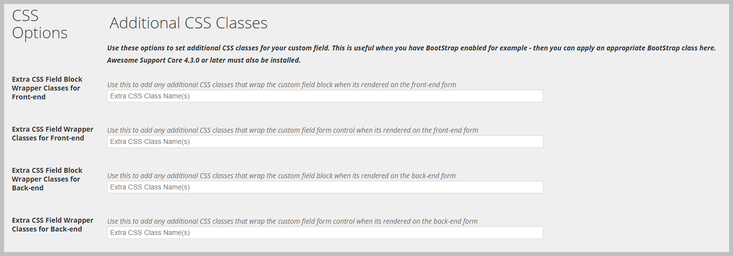
By default, columns are all given the same width. But you can create different sized columns using Bootstrap CSS classes. The Custom Field definition screen has a section for adding CSS class names to the field – that section looks similar to the following:
You can place Bootstrap CSS class names in the fields shown above to control the size of a column. For example you can use col-8 or col-6 as class names to get extra wide columns. Generally you want to place the class names in the first field shown in the image above. With the Bootstrap class names you can create row-column structures similar to the following:


