Report Ideas
Here are some ideas for useful custom reports.
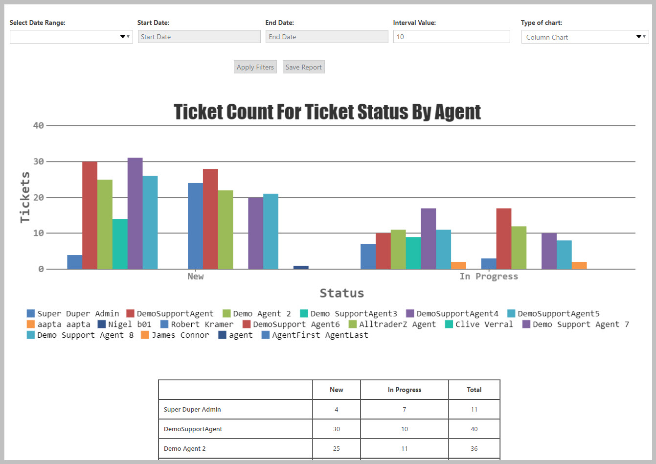
Which agents have the most open tickets?
Create this report by starting with the core TICKET COUNTS report.
- Choose Assignee as the 2nd dimension in the side-bar
- (optional) Choose the status(es) you want to see on the report from the Status section in the side bar
- Choose Column Chart as the chart type
- Click the RUN REPORT button (Used to be the APPLY FILTERS button in prior versions). Your report should look similar to the following.
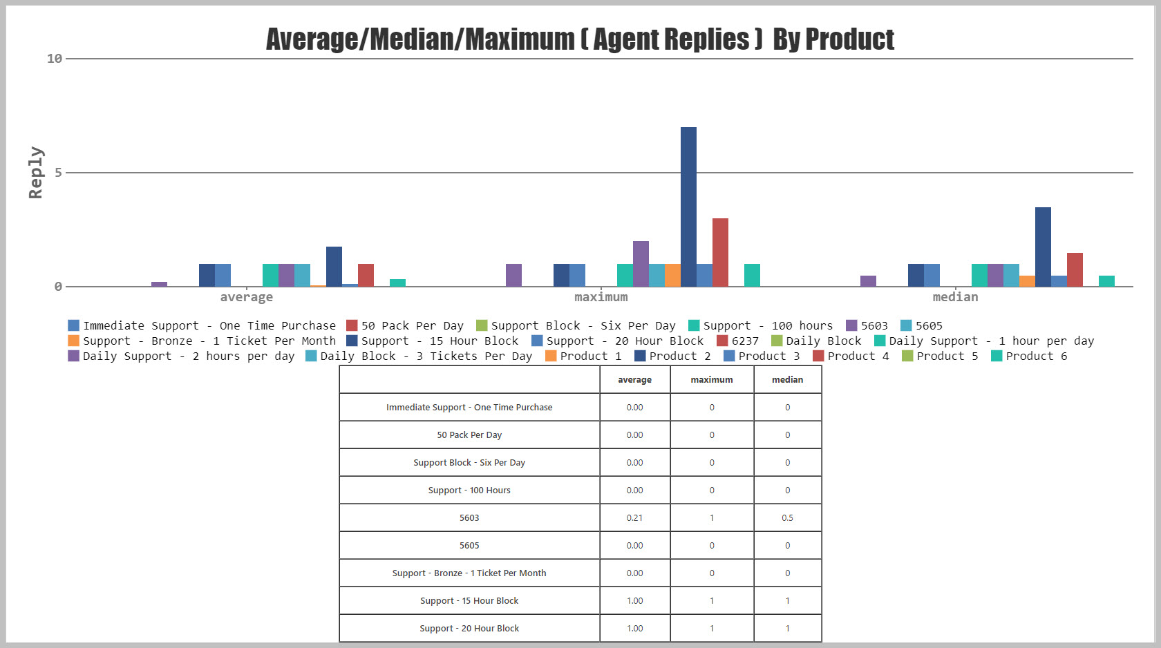
Which products take up most of your agents time?
If you provide support for multiple products you can get an idea of which products take up most of your agents time by looking at the number of replies for closed tickets. So, start off with the PRODUCTIVITY ANALYSIS report.
- Choose Product as the 2nd dimension in the side-bar
- Choose Column Chart as the chart type
- Click the RUN REPORT button (Used to be the APPLY FILTERS button in prior versions)
- Scroll down to the last chart on the page and look at the AVERAGE area. The product(s) that take up most of your agents time will be the ones with the tallest bars.
That chart should look similar to the following:
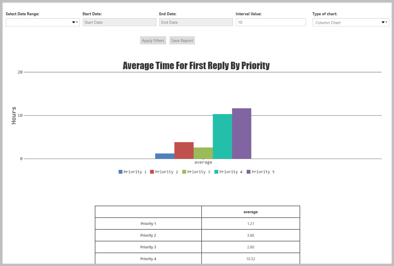
What is the average time to send the first reply to a high priority ticket?
Do you have an expectation for how long it should take before an agent responds to certain types of tickets? Then this report might be for you! The foundation for this one is the DELAY ANALYSIS core report.
- Choose Priority as the 2nd dimension in the side-bar
- Choose Column Chart as the chart type
- Click the RUN REPORT button (Used to be the APPLY FILTERS button in prior versions)
That chart should look similar to the following:
More Topics In Reports and Statistics
- Advanced Reports and Statistics
- Installation (Reports and Statistics)
- Overview (Reports and Statistics)
- Report Dashboard Overview
- Running Reports
- Filtering Reports (Standard and Custom Fields)
- Using The Second Dimension
- Saving Reports
- ADMIN: Security Roles For Reports
- ADMIN: Restrict Certain Users View Of The Data Based On Department
Search